3 examples of CLASSY custom picture Framing Makeovers
art & framing inspiration
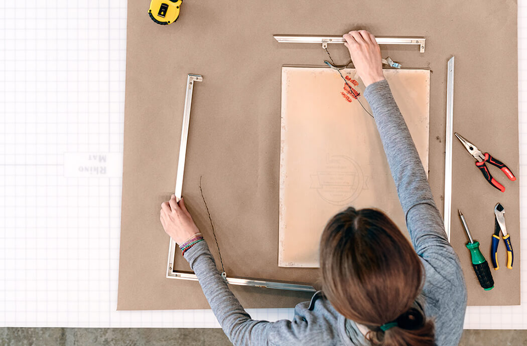
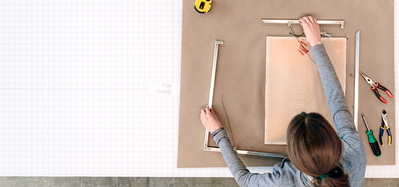
Hey friends! Today we’re reviewing some of our recently completed framing makeovers!
You know that framed piece in your home that you hide away, maybe in a closet or some other strange dark room that no one goes into? Mmhmm, you know what I’m talking about. It could be art that you inherited in an old frame that’s falling apart, or something you had framed ages ago and now just gives off dated vibes. It could even be art that you picked up pre-framed, but let’s just say that the framing is definitely not something you would have ever picked out yourself… Okay, now imagine you take that piece to your favorite framers at Hang Steady 😉 and transform it into something you are proud to display in a prominent spot in your home. That would be awesome, right? Well, that’s exactly what happened with these three framing makeover projects you’re about to see!
Honestly, these types of framing projects are my absolute favorite to work on. A frame design can really make or break how you feel about the presentation of the art on your walls. With makeovers, we get the opportunity to rethink what design is best for a given piece of art. Many times we can also help to save the work from the harmful internal materials and mounting methods that were used in the past. A total win, win!
I hope that these fun, transformative projects will excite and inspire you to want to take your own framing rehab from drab to fab! Because if you’re not fully in love with your art (and framing!), you should be.
No. 1
Custom Framing Makeover
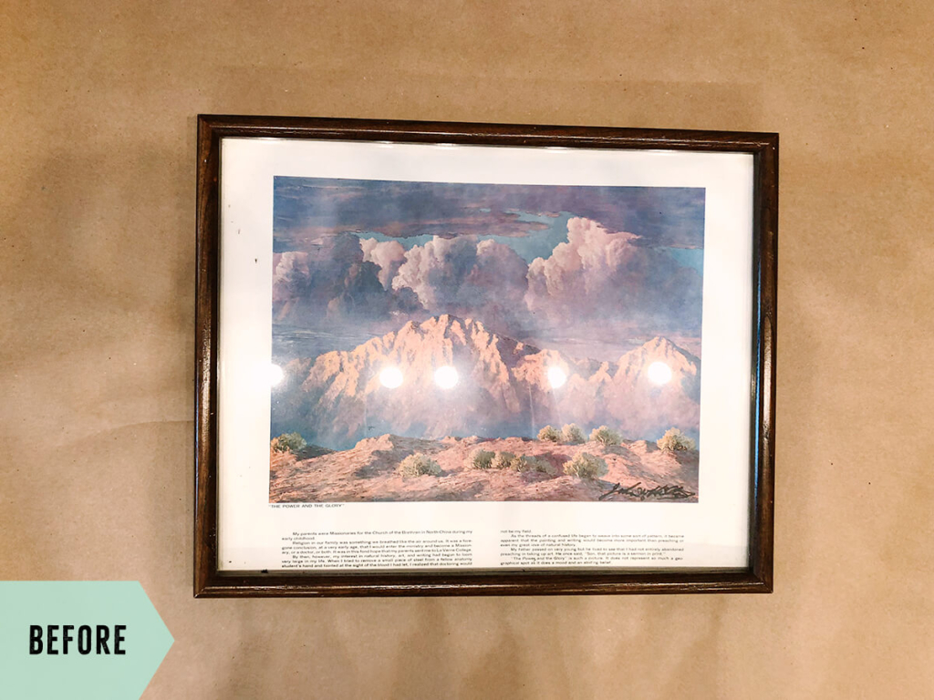
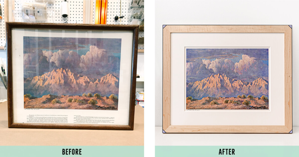
For several years now, we have been helping one of our awesome West Adams clients frame pieces for an epic, eclectic gallery wall in his condo. This special project involved a piece that originally belonged to his dad. Our client always loved this print, but wanted to give it new life with a fresh look so it could fit in seamlessly with his more modern style and other art pieces.
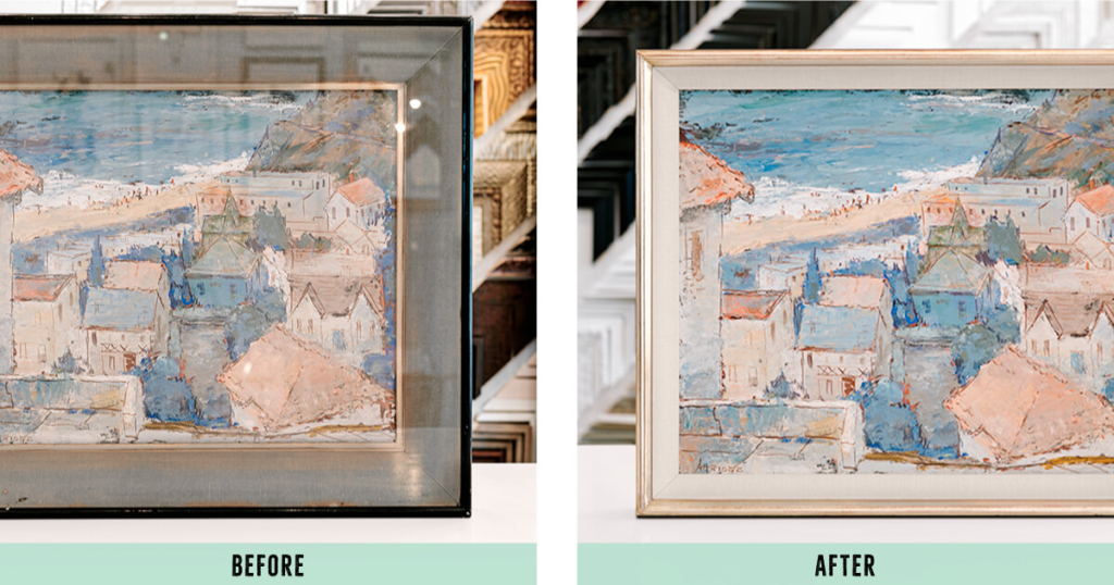
Where we started
![]() Art that was badly warped and bowed from the previous mounting method + age
Art that was badly warped and bowed from the previous mounting method + age
![]() Glass with no UV protection and tons of glare
Glass with no UV protection and tons of glare
![]() A frame package that was not sealed properly, allowing dust, dirt, and bugs (eek!) to accumulate inside on the art
A frame package that was not sealed properly, allowing dust, dirt, and bugs (eek!) to accumulate inside on the art
The Framing Plan
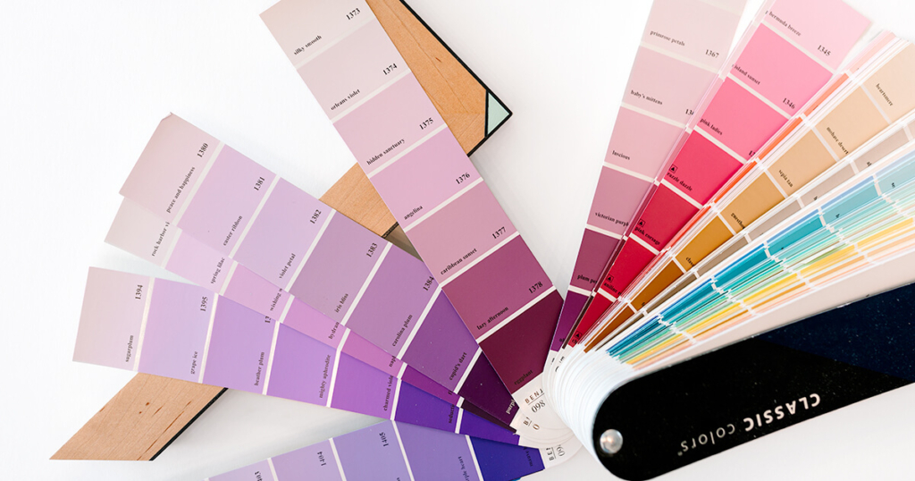
We decided on an approach that would make the piece look more like art and less like a poster print. Simply covering most of the text at the bottom with a wide mat made the biggest impact towards that goal. Since most of the framing we have done for this particular client involves a lot of color, we incorporated a fun, hand painted, colorful corner detail into the frame. The geometric painted design that we went with just screams modern vintage aesthetic. It’s one of my favorite designs for marrying the two styles.
Challenges Along The Way
Once we had rescued the art from its original frame (And the bugs! Remember the bugs?!) we discovered that the piece had been permanently adhered to its mounting board when framed previously. Sometimes when we encounter a piece that appears bowed, it’s actually the board behind the art that is warped, and the art itself is still relatively flat once it comes out of the old frame package. Since this wasn’t the case here, and we couldn’t remove the art from its mounting board, we secured the original bowed board to a stronger corrugated plastic backing, eliminating the warp and keeping it flat into the future.
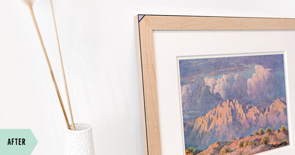
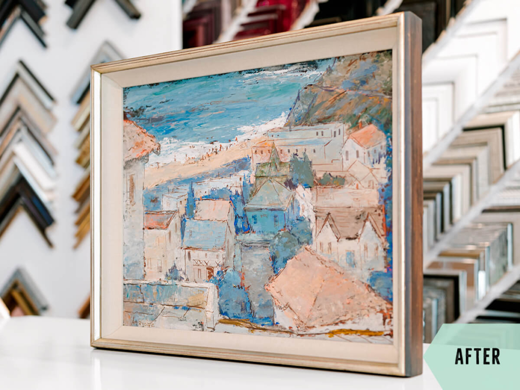
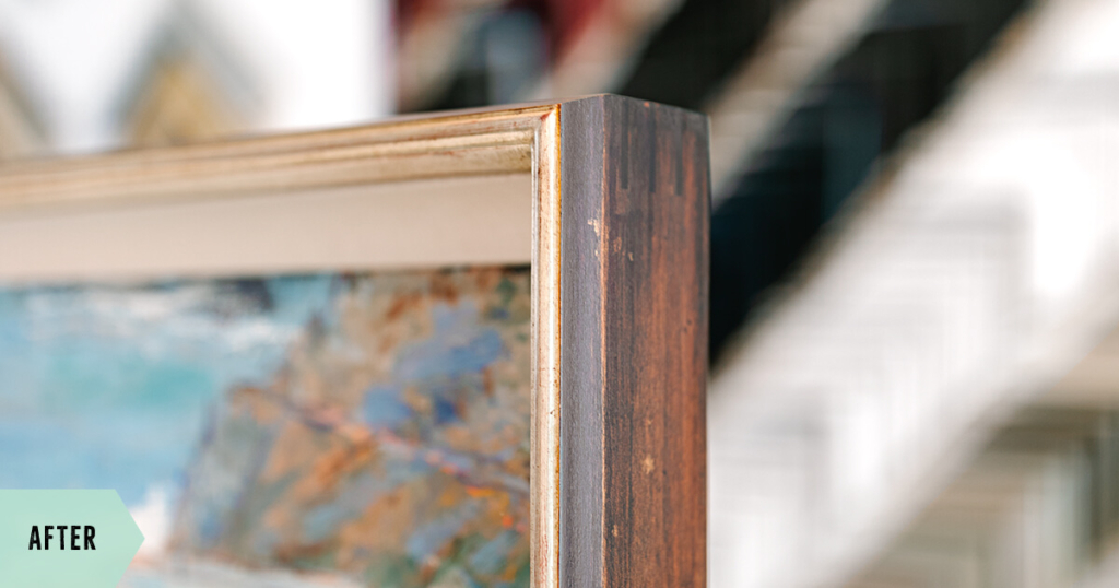
The Final Result
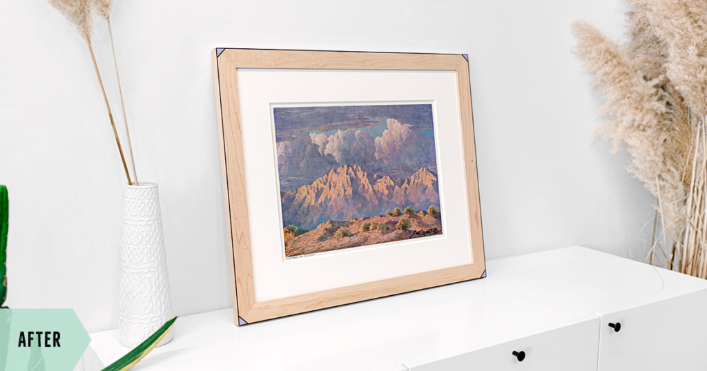
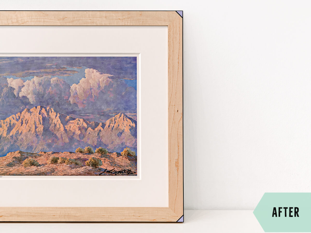
![]() A deliciously hand finished maple frame makes this design feel timeless
A deliciously hand finished maple frame makes this design feel timeless
![]() Hand painted custom color frame and pinstripe details add personality
Hand painted custom color frame and pinstripe details add personality
![]() Extra thick, wide white mat transforms the poster into an art print
Extra thick, wide white mat transforms the poster into an art print
![]() Fixing the warped old mounting board makes the art flat again for years to come
Fixing the warped old mounting board makes the art flat again for years to come
![]() Non glare 99% UV filtering glass allows the art to be seen clearly
Non glare 99% UV filtering glass allows the art to be seen clearly
No. 2
Custom Framing Makeover
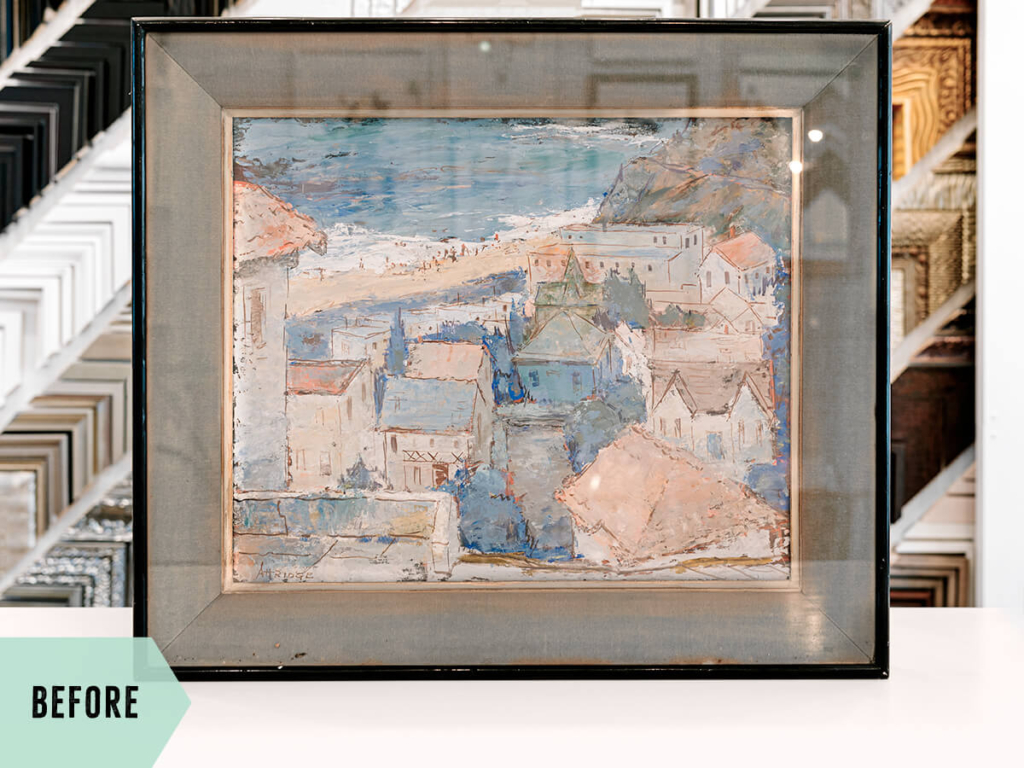
Next up is a piece from a couple in our very own Beverlywood neighborhood. These sweet and lovely clients just adored the soft feel of this painting, but suspected that the original framing was making it feel heavier and darker than necessary. Together, we had the best time coming up with a refined and elegant solution that felt more aligned with the softness of the piece, but also maintained their favorite aspect from the original design (more on that below!).
Where we started
![]() Wobbly and separating frame joins
Wobbly and separating frame joins
![]() Glass with no UV protection and tons of glare
Glass with no UV protection and tons of glare
![]() The frame package was not sealed, allowing dust, dirt, and bugs (double eek!) to accumulate inside
The frame package was not sealed, allowing dust, dirt, and bugs (double eek!) to accumulate inside
The Framing Plan
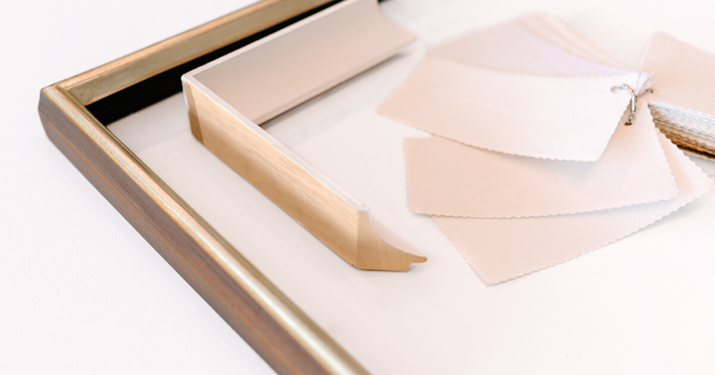
It’s hard to show the dimension in the before picture, but the original faded gray mat liner was actually about two inches deep! Can you believe it?! While the clients did not love the width, color, or shape of the original liner, they did love the dramatic effect that the depth provided to the art. I don’t blame them- I’m an absolute sucker for some dimensional oomph in frame designs. It’s a definite game changer, so we knew from the jump that we wanted to keep this detail in the makeover design.
Challenges Along The Way
Despite all of the dust and bugs (did I mention the bugs?!😂) in the frame, the art only required some minimal cleaning to make it look its best. To accommodate the dramatic depth of the new cream linen-wrapped scoop liner, the frame was custom milled accordingly. This required a little extra time and careful engineering upfront to ensure that everything would fit once it came time for assembly.
The Final Result
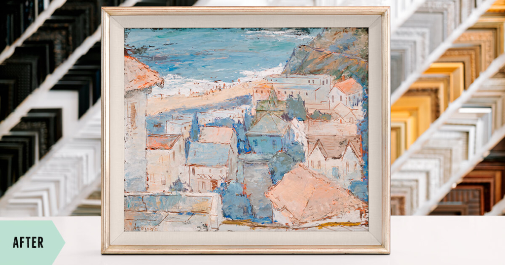
![]() Deep, cream linen-wrapped scoop liner gives striking dimension, enhancing the art
Deep, cream linen-wrapped scoop liner gives striking dimension, enhancing the art
![]() Hand water gilded frame detail gives a subtle elegance and brightness to the whole affair
Hand water gilded frame detail gives a subtle elegance and brightness to the whole affair
![]() Dark stained and vintage patinaed wood side provides contrast, emphasizing bright highlights
Dark stained and vintage patinaed wood side provides contrast, emphasizing bright highlights
![]() Non glare 99% UV filtering glass allows the art to be seen clearly
Non glare 99% UV filtering glass allows the art to be seen clearly
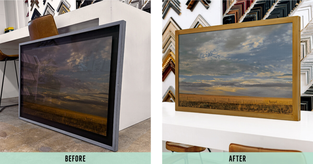
No. 3
Custom Framing Makeover
Our third and final makeover on this list was for another local client who always loved this calming golden-hour landscape print on aluminum, but was not a fan of the dark and rustic feeling of the original framing. She felt like most of the time the black mat just sucked up the surrounding light, making it genuinely difficult to see the actual artwork. Like makeover #2 above, the goal here was to brighten up the image and framing, and bring it a little more up to date.
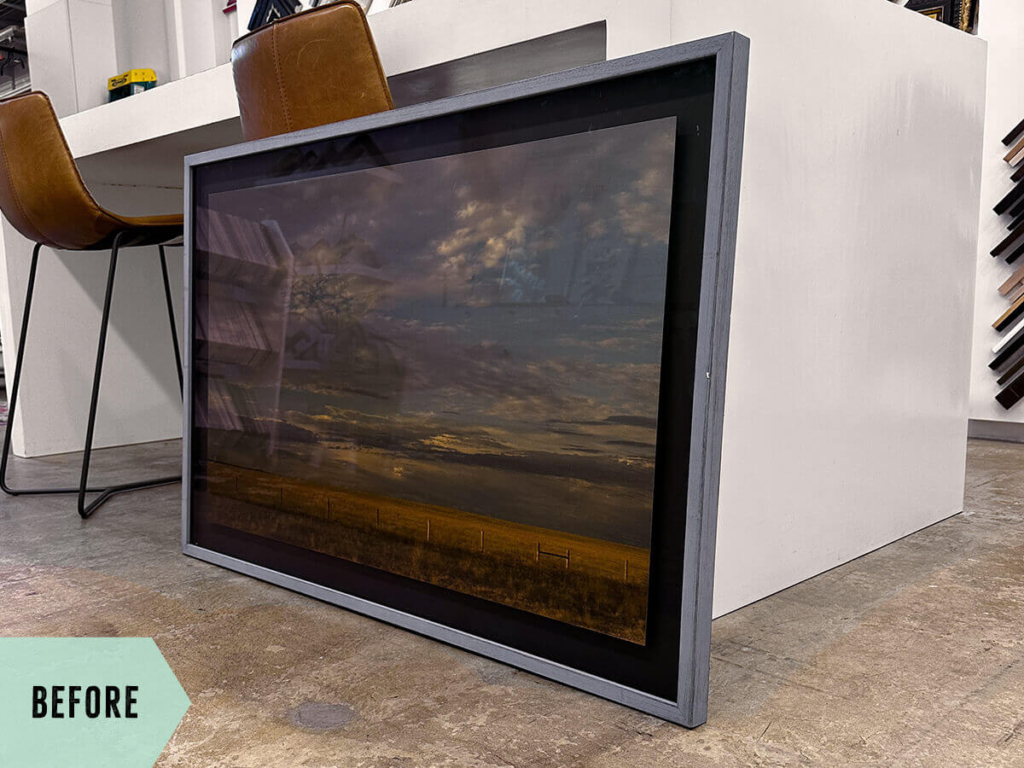
Where we started
![]() The aluminum print was permanently mounted to foamcore and the black backing mat. This required some special attention that we’ll get to below…
The aluminum print was permanently mounted to foamcore and the black backing mat. This required some special attention that we’ll get to below…
![]() The frame had multiple dings and dents throughout
The frame had multiple dings and dents throughout
![]() The glare from the glass and black mat were seriously weighing this piece down to the point where it was legitimately impacting its visibility
The glare from the glass and black mat were seriously weighing this piece down to the point where it was legitimately impacting its visibility
The Framing Plan
In order for this piece to finally be seen and enjoyed properly, the black mat and glass had to go. Removing glass altogether isn’t typically something we recommend, but since this was a print on aluminum composite and had a UV finish already applied, humidity and light damage concerns were relatively low. Removing the mat border in favor of framing full-bleed to the edge of the artwork brightened things up and rescued that inviting, warming glow that had been lost. No more doom and gloom!
Challenges Along The Way
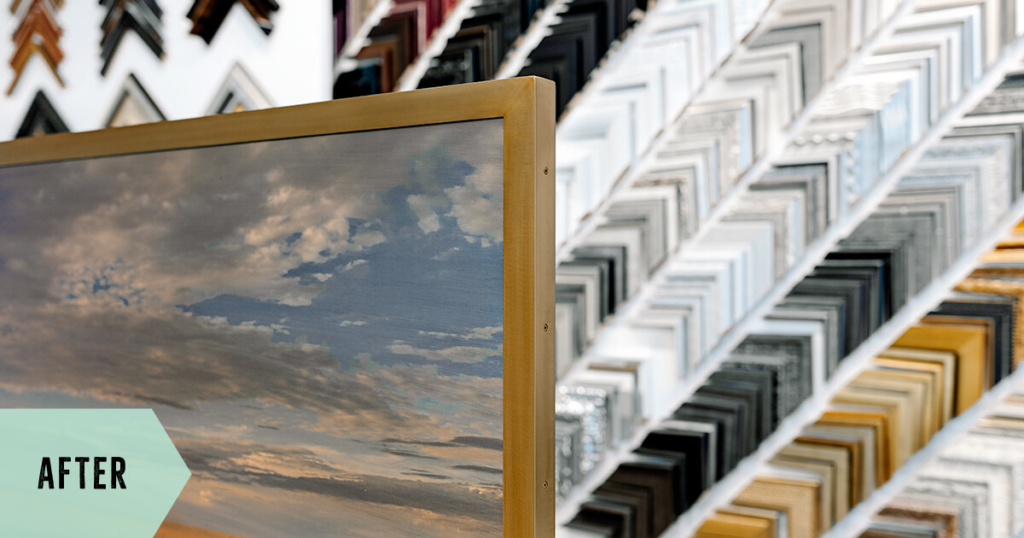
This piece had only been framed a few years ago, so thankfully it was sealed properly and fairly clean. However, the art was permanently mounted to its floating platform, as well as to the black mat backing, and then, oddly, secured with many large rivets. Since the piece could not be removed, we trimmed the excess margins of the backing mat down, filling in around the empty space behind the art to support the edges and prevent any damage from bending. Finally, we added a single corrugated plastic board to the back, with cut outs to fit around the protruding ends of the rivets, making it flush in the back of the frame. And speaking of the frame, this welded steel number with bronze patina is a real stunner! Somewhat heavy to lift, but light on the eyes 😉 Like makeover #2, this one needed to be moderately deep because of the mass of boards all riveted together. This just necessitated a little forethought when selecting a frame that was either already deep enough, or could be customized/modified to the depth we needed.
The Final Result
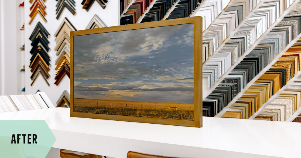
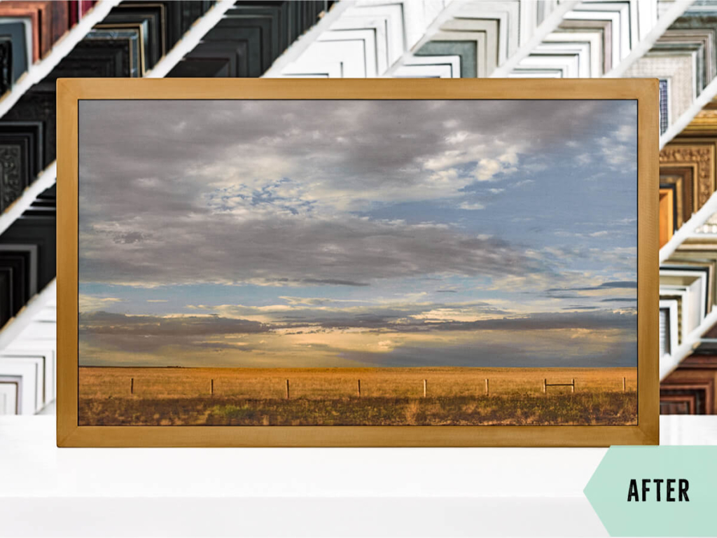
![]() The piece can finally be SEEN (Hooray!!!)
The piece can finally be SEEN (Hooray!!!)
![]() Print on aluminum composite with UV finish meant we could get away with not using glass in order to beat that pesky glare
Print on aluminum composite with UV finish meant we could get away with not using glass in order to beat that pesky glare
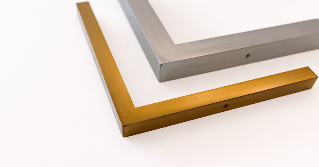
![]() Welded steel frame with brass patina brings out the highlights of the art to perfection
Welded steel frame with brass patina brings out the highlights of the art to perfection
I will never stop being amazed by the impact that great custom framing can have on a beautiful piece of art. The difference really can be night and day! As always, we believe that our job is to protect and preserve, while also enhancing the inherent qualities and traits of any piece of artwork, with quality framing and design. But that certainly doesn’t mean the framing has to be boring!
Do you have any pieces that might need a refresh? Let’s work some magic together!
That’s it for our first framing makeover roundup, but there’s so many more where these came from! Expect more posts showcasing the awesome rehab framing projects that you lovely people have entrusted us with.
Oh, and hey, sometimes I forget to take a “before” shot, so if you’re bringing us a piece to reframe, please help a girl out and remind me to go grab my camera before disassembling your old frame. Thank you, friends!
Frame what makes you happy!
-Andria